




It’s time for OneFootball to highlight some of the week’s main releases.
Check out the roundup below and have your say: which shirt is the best looking?
Brentford 🏴
Brentford have kept their policy of using the home kit for two consecutive cycles. The shirt below will be worn in the 2026/27 and 2027/28 seasons.
Advertisement
The idea behind the more sustainable project is to reduce costs for fans and lessen the environmental impact of producing new kits.
The big new feature is the addition of honey-yellow details.
Check out all the details here.
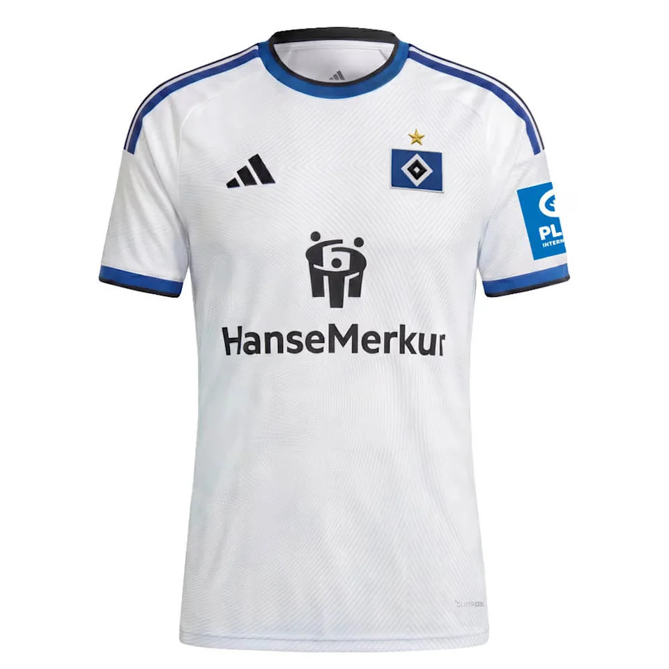
The Volksparkstadion was the inspiration for the German club’s new home shirt.
A light-blue graphic runs across the entire front of the kit. It references the structure of Hamburg’s stadium roof illuminated by the floodlights.

Learn everything about the shirt here.
Inter Milan 🇮🇹
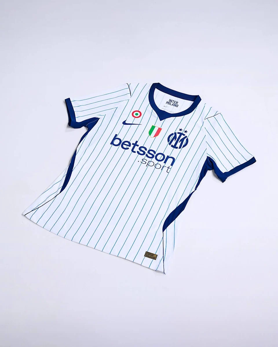
Nike drew inspiration from the world of baseball for the new away kit of the current two-time Italian champions.
Advertisement
The shirt has a white base with thin blue vertical pinstripes, echoing the traditional look of teams in the sport.

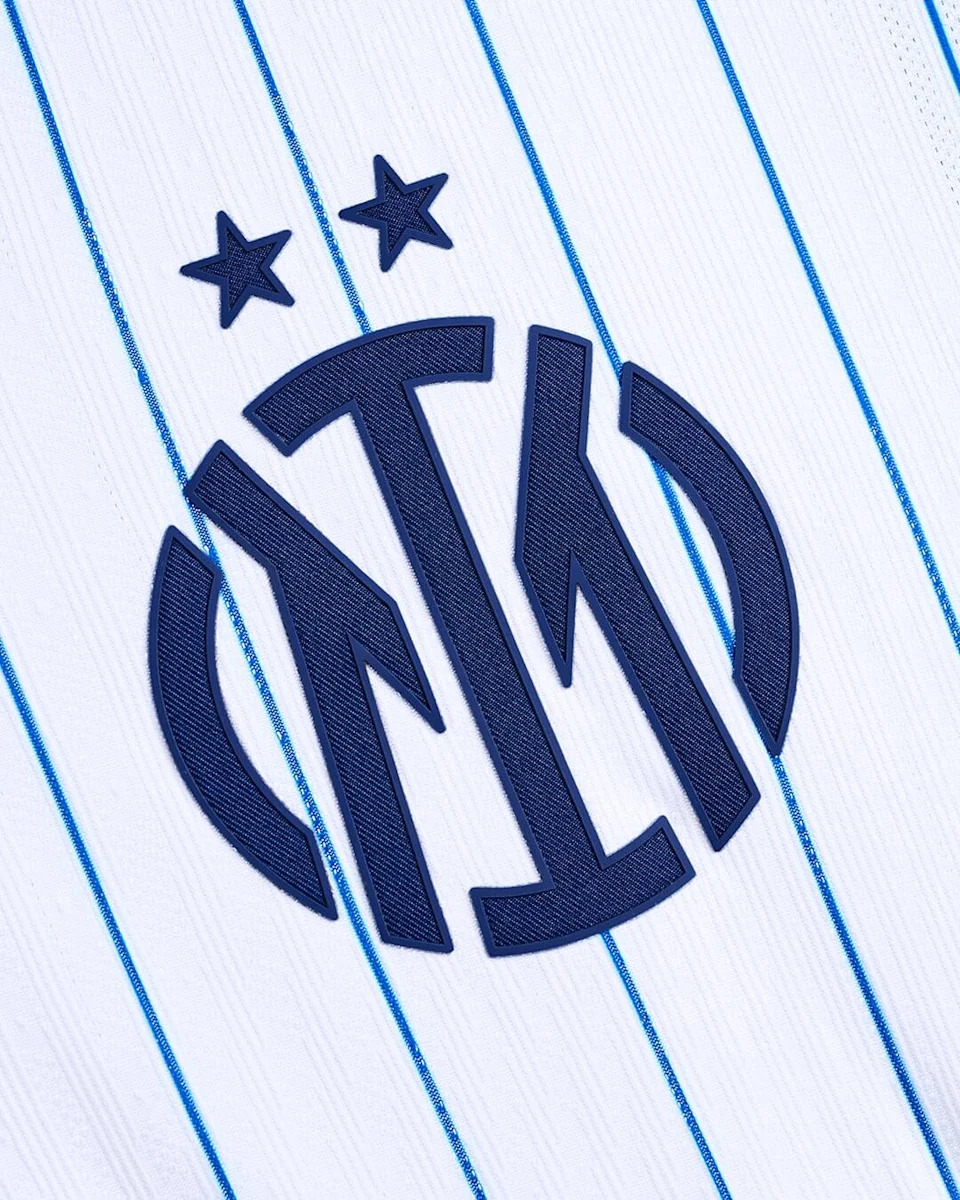
One of the highlights is the crest. The circular badge has been replaced by a monogram formed by the letters “I” and “M”, applied in an enlarged size and with a twill finish.
It is a clear reference to the traditional markings on baseball franchise shirts. The New York Yankees, for example.
See everything about the release here.
The away shirt of the club from the Italian capital offers a reinterpretation of one of the most striking elements in the club’s history: the stripes.
Advertisement
The traditional conventional stripes have been replaced by thin, irregular diagonal lines, combining light blue and navy blue.
The idea was to create a “feeling” of movement.
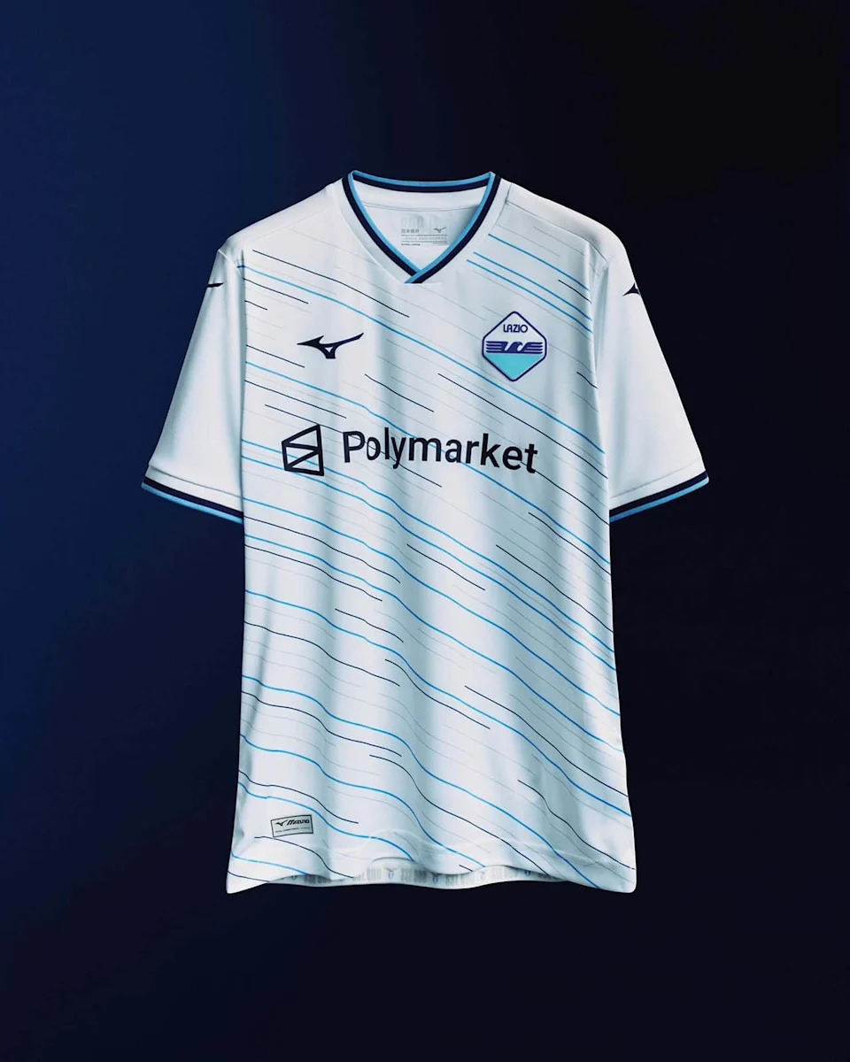
Learn everything about the shirt here.
The home shirt of the two-time European champions is a tribute to Mist roll’in (rolling mist), the pre-match anthem sung before the club’s games at the City Ground.
The base is the traditional red, with a print based on the classic Garibaldi pattern inspired by the lyrics the fans sing.
The idea is for the print to “imitate” mist and fog.

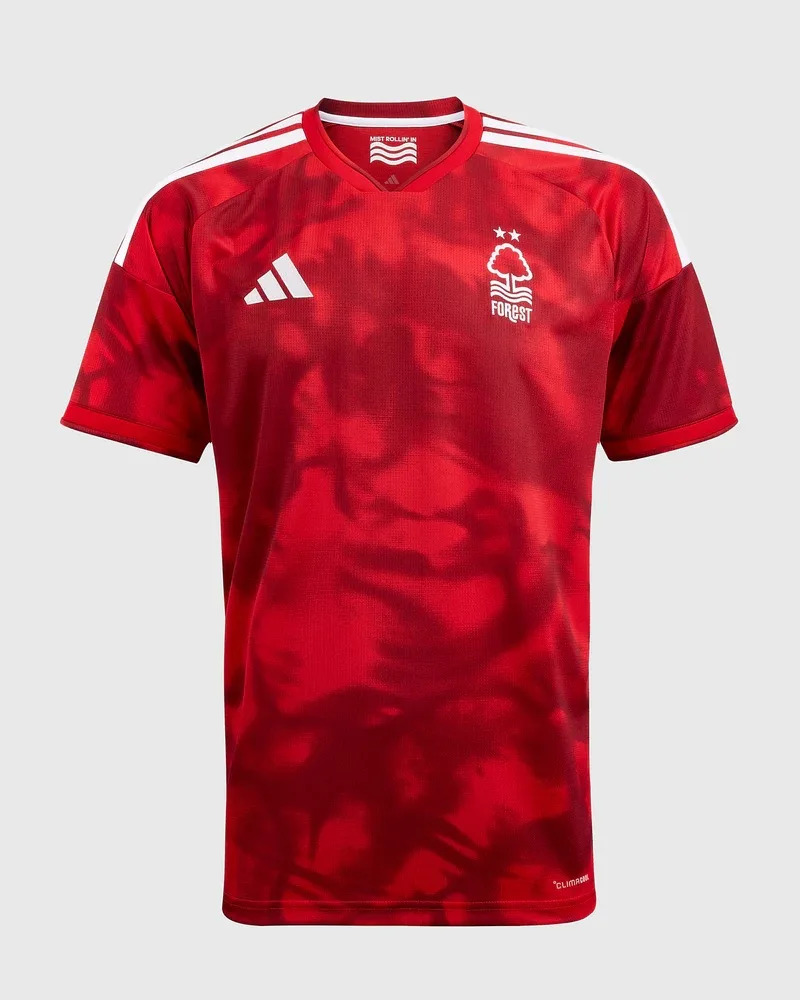
Check out all the details here.
Advertisement
Dea’s new home shirt features the now traditional black-and-blue vertical striped design.
This time, the new feature is the various shades of the colors, which reference the architecture of the New Balance Arena, the club’s home.

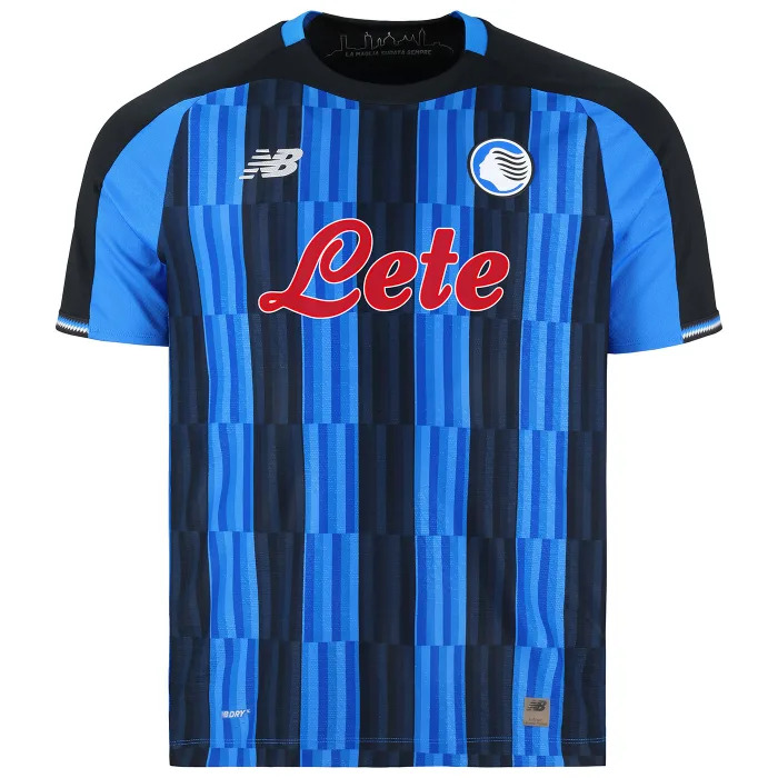
See everything about the release here.
Sporting 🇵🇹
Nike’s 120th anniversary is celebrated in the Portuguese club’s new home kit.
The supplier chose to use an old template.
One of the big differences is the shade of green used, which is darker.

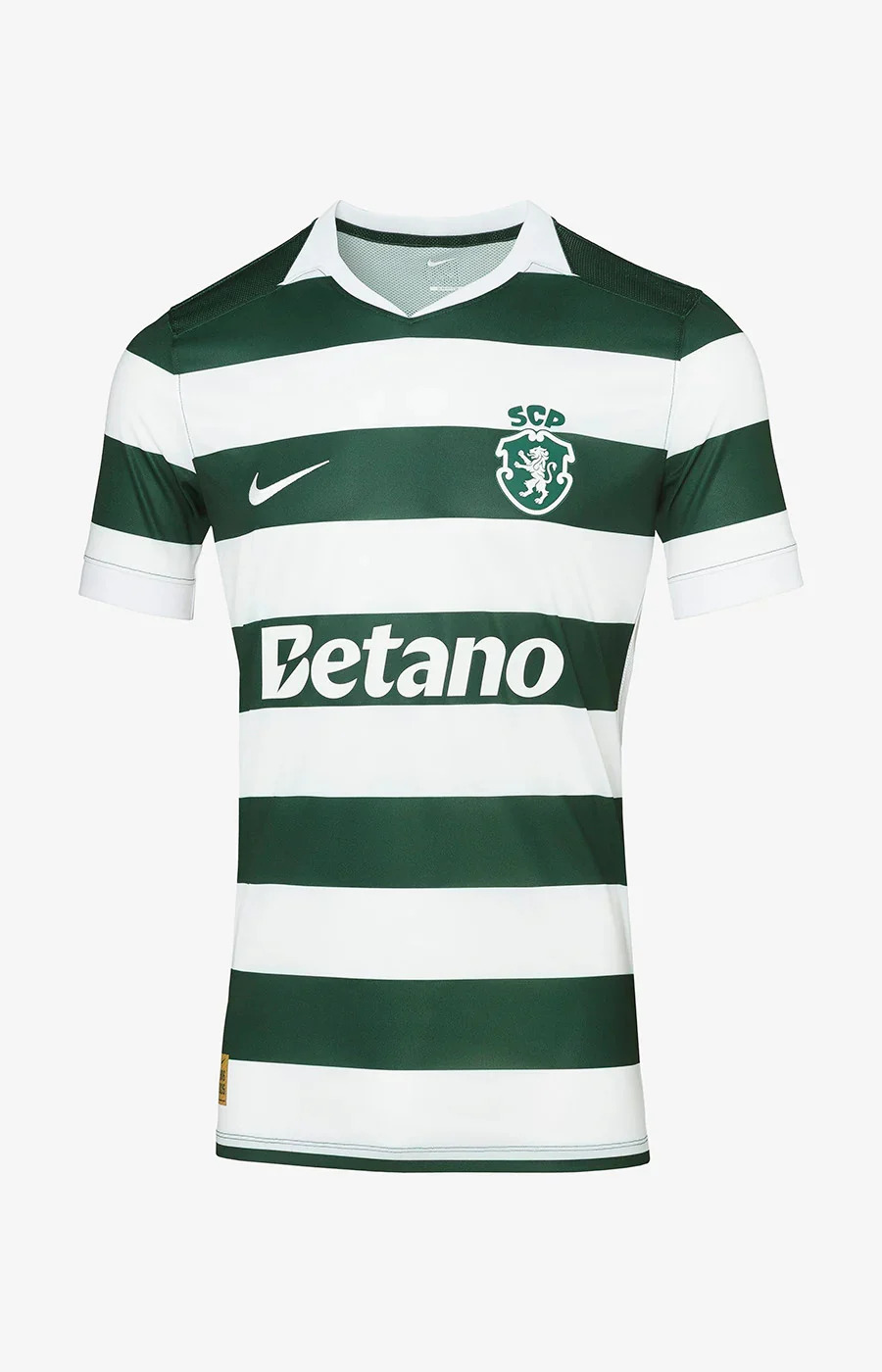
Learn everything about the shirt here.
Venezia 🇮🇹
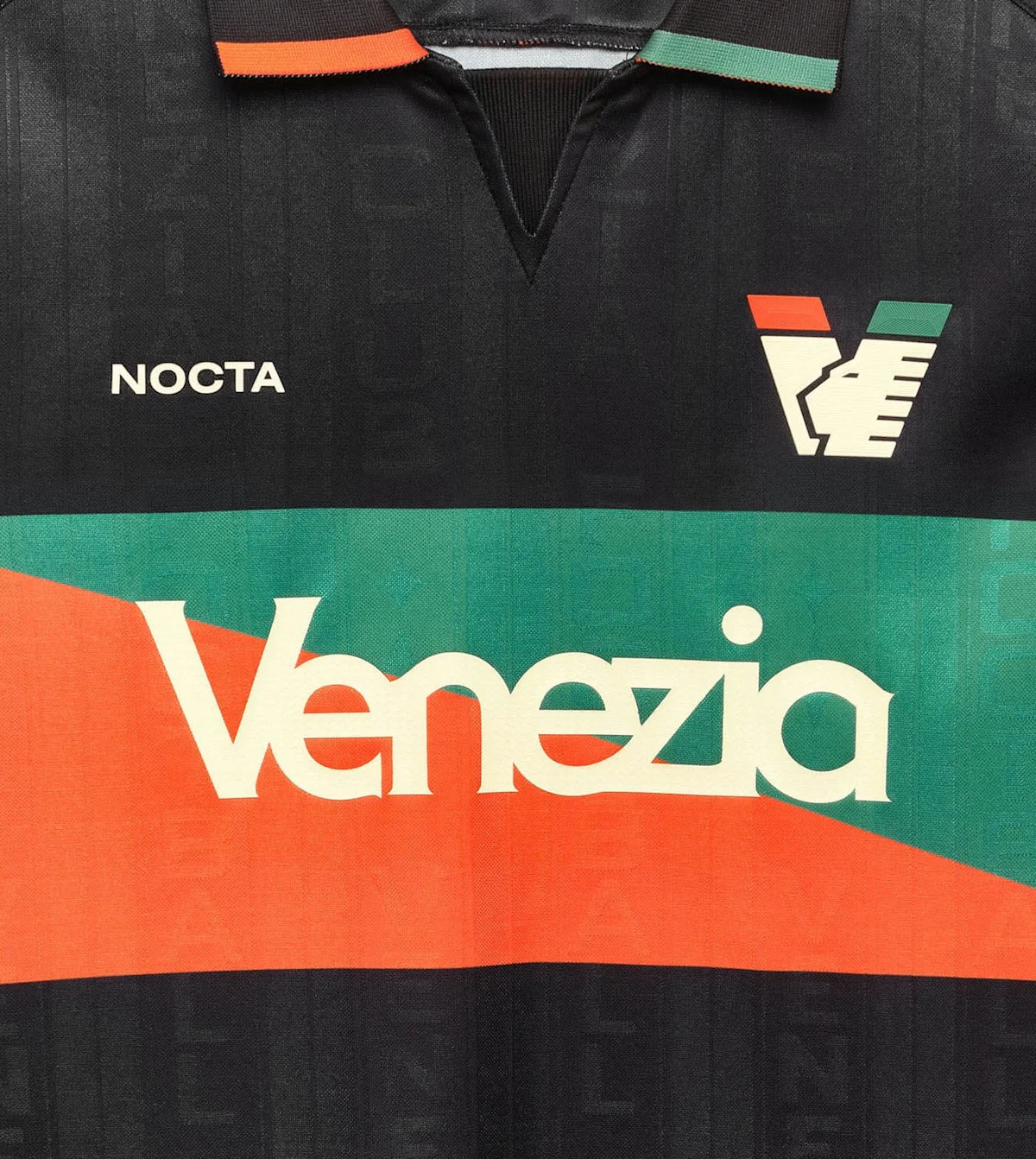
The home shirt of the club returning to Italy’s top flight was created by Nocta, the clothing brand signed by the rapper in partnership with Nike.
Advertisement
The piece highlights the club’s historic identity. The inspiration comes from the flags that stand out at the Pier Luigi Penzo Stadium on matchdays.
Another highlight is the polo collar, a feature of classic football shirts.

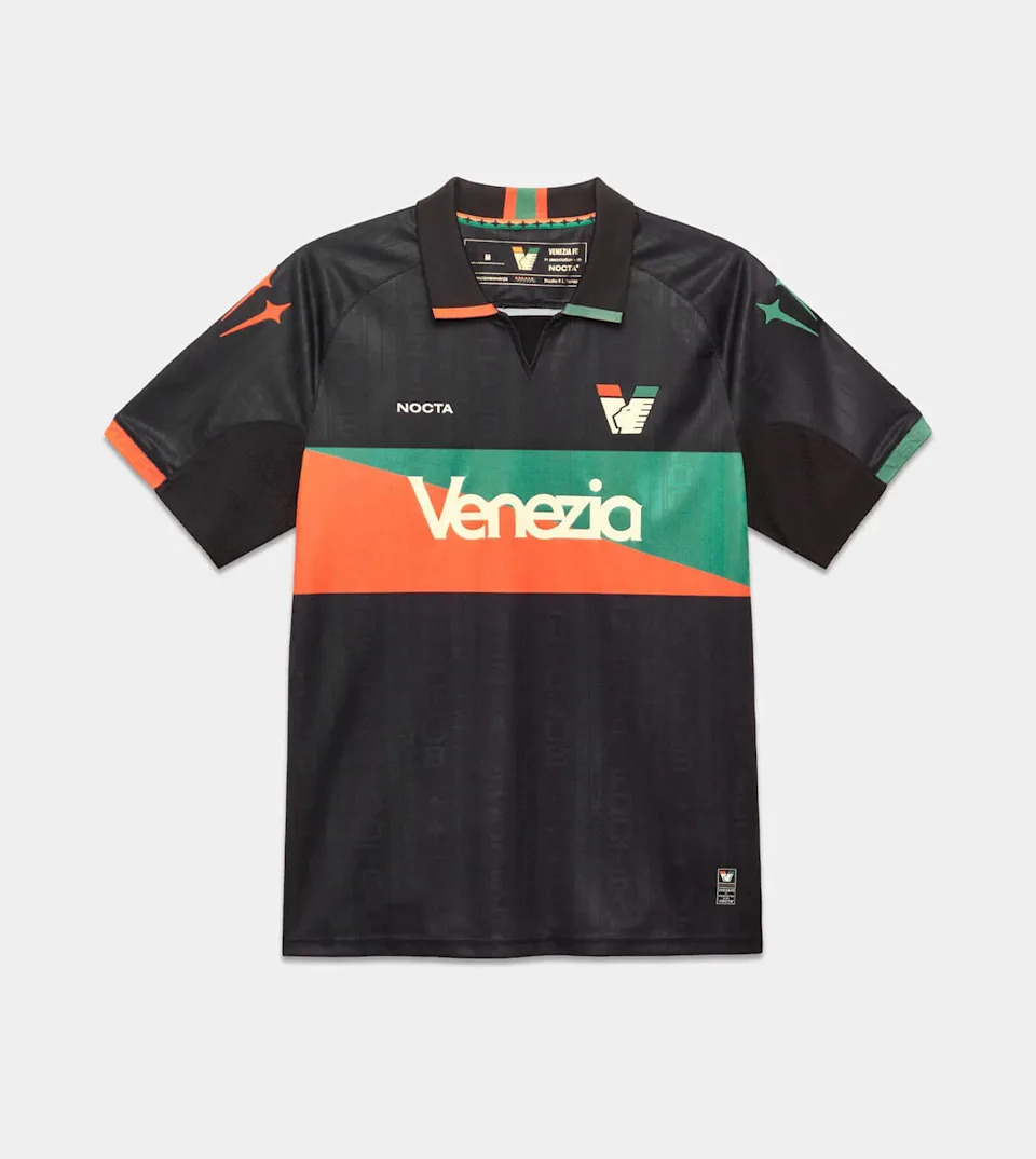
Check out all the details here.
PSV 🇳🇱
Tradition is present in the new home shirt of the current two-time Eredivisie champions.
The black lines stand out.
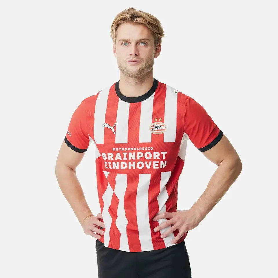
See everything about the release here.
After a home shirt with “too little white” last season, the traditional stripes are back in equal form, with the addition of gold.
It is a tribute to the Udine club’s 130th anniversary.

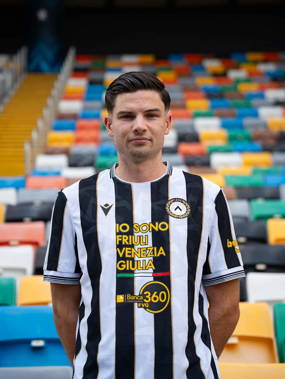

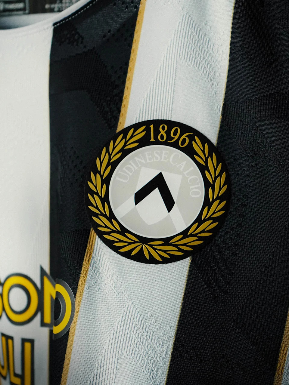
Learn everything about the shirt here.
Advertisement
Crystal Palace 🏴
The current Conference League champions are going back to the 70s when it comes to their kit.
The design used in that decade is the highlight of the home shirt.
Out go the royal blue and red stripes, replaced by a sash.
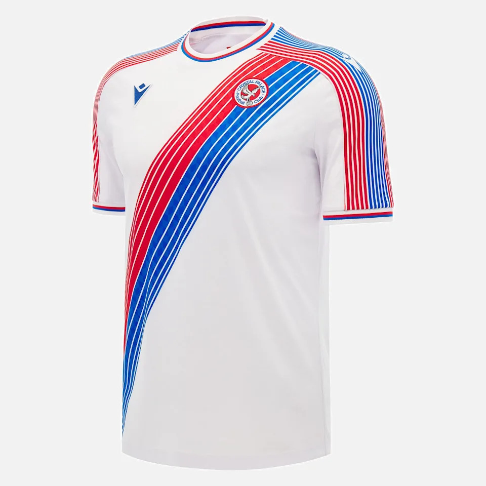
Check out all the details here.
This article was translated into English by Artificial Intelligence. You can read the original version in 🇧🇷 here.
Read the full article here


